Hi to everyone ![]()
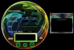
Firstly the rgn is a lot better on this skin than the last one! I tried a simple shape this time (circle) I think it paid off ![]() . Nothing special about the buttons but I thought they suited the skin. I tried to make the info box more interesting this time. I also think that the snd writing suits this skin. I also put in a cursor which displays a target, what do you all think? Last thing is the music file, I did this one for a bit of fun, It's easy to change if you don
. Nothing special about the buttons but I thought they suited the skin. I tried to make the info box more interesting this time. I also think that the snd writing suits this skin. I also put in a cursor which displays a target, what do you all think? Last thing is the music file, I did this one for a bit of fun, It's easy to change if you don

Recommended Comments
Create an account or sign in to comment